Back in the days when the internet wasn't around to tell me which movies to go see, I had to rely on other sources for movie information--newspapers, schoolyard chums, previews, etc. But probably the easiest way to judge if something was worth seeing? The movie poster.
 |
| I would be lying if I told you this wasn't still up in my bedroom back home. |
After all, who has the time to watch a lengthly trailer when you can instantly glean all the information you want about a movie from its poster? These 27" x 41" sheets are easily viewed and ready-to-judge, both important factors when one is making snap judgments. Which movie deserves my business more? The Dark Knight or Old Dogs? Well, which one has the better poster? Clearly, Old Dogs. Boom, decision made. No regrets.
Even though we don't always think about them, movie posters are a big deal. Therefore, I would be remiss if i didn't examine Julie & Julia's movie poster at least once on this 365-day journey of mine.
I'm sure many of you have seen this bad boy before. In terms of poster aesthetics, I suppose it is pretty hip and/or cool. I mean, the parallel Julie/Julia stories are well-illustrated with parallel photos on top and bottom. And I do appreciate that Amy Adams is on the bottom, where she rightfully belongs. This really is Meryl's movie.
Plus, their offsetting positions within the frames are quite pleasing to the eye. Speaking of which, both Meryl and Amy's facial expressions suggest 2 hours of great fun ahead of anyone who'll shell out for a ticket. I'm sure many dudes only agreed to go see this movie with the girlfriends with the subliminal promise of Amy Adams sucking on many, many things.
I also like the sophisticated fonts used in the text. It shows that this movie is probably going to be classy as fuck. Plus, the lime green and orange text really pops on that black background.
Good work, movie poster designers. This one's a keeper. A true original.
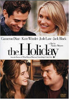
Errrrr... so okay, maybe not. Maybe it's just a poster design fad for romantic comedies of the last few years... Damn.
I don't deserve any credit for discovering this trend though. While I was looking into poster guidelines and conventions, I stumbled upon this insightful blog entry from Cade's Film Journal, which goes on an in-depth analysis and details/deconstructs the layout of these romantic comedy posters. Check it out, it's pretty cool stuff (I will take full credit in discovering it and passing it off as my own).
So basically, Julie & Julia is trying to pass itself off as a sophisticated, realistic romantic comedy in the same vein as the semen-swapping Jennifer Aniston vehicle, "The Switch."
-------------------------------------------------------------------------------------------------------
Julie & Julia Quote of the Day: "He came home exonerated, but thoroughly bruised."


No comments:
Post a Comment